How Good is Your Signage?
A speaking colleague of mine and Marketing Guru Winston Marsh, told me years ago that you have to be a better Marketer of what you do than a Doer of what you do. Without some effective marketing, people wont know what product, service or value you offer.
At a Trade Show or Expo, you need to put this principle on steroids!
You have such a short time to get the visitor’s attention, let alone their interest. It astounds me how people still put up posters with sooooo much text on it that it makes your head spin. Or has a fabulous picture but nothing that actually tells you what they do. You have to make your signage work for you.
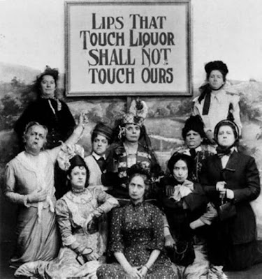
Here is a great example of signage which misses the mark.
PICTURE: Not sure of the original source, but lovely Bronwyn sent it to me. It sure is funny!


Smash Hit Displays
Good trade show graphics are crucial to the success of your booth. In this case, simple definitely conquers over-the-top. Minimal text, one or two photos, and the name and website of your business is really all you need. Think of how a billboard is designed: visitors will take a look as they are walking by, giving you 3 seconds to catch their attention. The graphics should definitely target your demographic in order to get the right people to come to your booth.
Great article!